Mapping Socio-Economic Inequality
Socio-economic inequality is a big problem that affects communities all over the world. This article looks at how Geographic Information Systems (GIS) help map and show these differences. By using geospatial data and analysis, experts and leaders can better understand what causes inequality. This helps them create more effective solutions.
Inequality shows up in many ways, like unequal access to education, healthcare, and jobs. It also affects income, wealth, and living standards. Using GIS to map these issues can uncover patterns that aren’t clear from just looking at numbers.
This article explores how GIS is used in social research. It shows how these tools help map important social indicators, find areas of need, and see how policies work over time. By combining different data and using advanced methods, GIS helps leaders make better decisions and use resources wisely.
Key Takeaways
- Socio-economic inequality is a complex issue that requires a multifaceted approach to understand and address.
- Geographic Information Systems (GIS) offer powerful tools for mapping and visualizing socio-economic disparities, revealing spatial patterns and trends.
- GIS-based mapping can support evidence-based policymaking and community engagement in addressing inequality.
- Effective utilization of GIS for mapping socio-economic inequality requires access to reliable data and consideration of ethical implications.
- Continued research and innovation in GIS technologies can further enhance our ability to tackle socio-economic challenges and promote more equitable communities.
Introduction to Socio-Economic Inequality
Socio-economic inequality is a complex issue that affects many. It’s about how wealth, income, and resources are spread out. This unfair spread can harm education, healthcare, jobs, and life quality.
Definition of Socio-Economic Inequality
Socio-economic inequality shows how resources and chances are spread out in a society. It looks at income, wealth, education, and healthcare access. The gap in income and wealth shows how unequal a society is.
Importance of Studying Inequality
It’s vital to study socio-economic inequality. This helps us understand why resources and chances are not shared fairly. By knowing the causes, we can work on making societies more equal and fair.
Key Factors Influencing Inequality
- Education: Quality education helps people move up and can reduce inequality.
- Healthcare: Unequal healthcare access can lead to health and life expectancy gaps.
- Employment Opportunities: Job differences can widen the income and wealth gap.
- Systemic Discrimination: Discrimination limits access to resources and chances.
- Geographic Factors: Urban and rural differences in resources and development cause inequality.
Knowing these factors helps us create plans to fight inequality. This way, we can work towards a more equal society.
The Role of Geographic Information Systems (GIS)
In social research, GIS is a key tool for studying socio-economic patterns. It combines data from various sources like census records and surveys. This helps create detailed maps of society’s complex dynamics.
What is GIS?
GIS is a computer system that handles geospatial data. It lets researchers compare different data layers. This way, they can see how factors like income and education relate in certain areas.
Applications of GIS in Social Research
- It maps poverty and wealth across regions or cities.
- It shows where people have unequal access to healthcare and education.
- It helps see how policies affect different groups over time.
- It makes data easy to understand for community decisions.
With GIS technology, researchers can find hidden links and show where things are unfair. This helps make policies that fight inequality and build fairer communities.
“GIS allows us to see the world through a new lens, revealing patterns and relationships that were previously invisible.”
As geospatial data analysis grows, GIS in social research gets more varied and important. It’s changing how we tackle big social issues.
Mapping Techniques for Socio-Economic Data
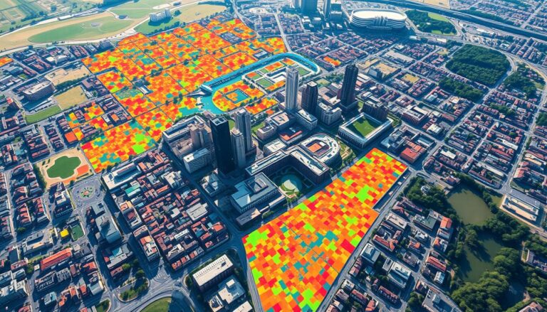
Visualizing complex socio-economic data helps us understand and tackle inequality. Tools like choropleth maps and heat maps give us insights into where socio-economic indicators are spread out. These data visualization techniques help policymakers, researchers, and communities spot and study inequality patterns in different areas.
Types of Mapping Techniques
Choropleth maps are great for showing quantitative socio-economic data. They color areas based on the data they display, like income or education levels. Heat maps, with their color gradients, are perfect for showing where socio-economic factors cluster together.
| Mapping Technique | Strength | Weakness |
|---|---|---|
| Choropleth Maps | Effective for displaying quantitative data | May be influenced by varying geographical sizes of regions |
| Heat Maps | Useful for identifying spatial clusters and hot spots | Can be less effective for precise quantitative comparisons |
Qualitative vs. Quantitative Spatial Data
When mapping socio-economic data, we need both qualitative and quantitative approaches. Qualitative spatial data adds context and nuance, like showing community resources or the experiences of marginalized groups. Quantitative spatial data lets us do precise statistical analysis and spot trends. Combining these two types of data makes our socio-economic maps more complete and impactful.
“Effective data visualization can transform complex socio-economic data into powerful narratives that drive meaningful change.”
Case Studies: Successful GIS Mapping Projects
Geographic Information Systems (GIS) are key in tackling socio-economic issues. They help us see complex data clearly. This makes it easier for leaders to find and fix problems like poverty and lack of education access. Let’s look at two examples that show how GIS can make a big difference.
Example 1: Urban Poverty Mapping
In a big city, GIS was used to map poverty. Planners combined census data, housing info, and community services. They found out where the poor lived, where healthcare was scarce, and where schools were lacking.
This detailed map helped the city plan better. They could focus on fixing roads, improving homes, and working with local groups. This way, they tackled poverty head-on.
Example 2: Education Inequality Analysis
A GIS study in a school district showed big gaps in education. It mapped student grades, school funding, and demographics. This showed a clear gap between rich and poor areas.
With this info, leaders could change how they spent money on schools. They started special tutoring and worked with poor communities. This made sure all kids had a fair chance to learn.
These examples show GIS’s power in fighting inequality. It helps us see problems clearly and make smart choices. This leads to real change in our communities.
| Project | Focus | Key Outcomes |
|---|---|---|
| Urban Poverty Mapping | Identifying urban poverty hotspots |
|
| Education Inequality Analysis | Exposing disparities in educational access and outcomes |
|
Challenges in Mapping Socio-Economic Inequality
Mapping socio-economic inequality is tough, especially with data access, quality, and ethics. We need to tackle these issues to make sure our efforts are both useful and fair.
Data Accessibility and Quality
Getting good data is a big challenge. Important info like income, jobs, and education is often hard to find or outdated. The data’s accuracy is key for making smart decisions and policies.
Ethical Considerations in Mapping
There are also big ethical worries about privacy and misuse when we map inequality. Showing where poor communities are can lead to stigma or even push them out. We must map carefully to keep people’s info safe and avoid harm.
To get past these hurdles, we need to work together. We must find a balance between using strong data and keeping ethics in mind. This way, we can really make a difference with inequality mapping.
Data Sources for Socio-Economic Mapping
Creating detailed socio-economic maps needs many different data sources. Each one gives us special insights and views. From government census data to research and non-profit work, these sources are key to understanding inequality.
Government Databases and Surveys
Government agencies collect a lot of census data and do socio-economic surveys. These efforts give us important info for mapping inequality. They offer detailed stats on demographics, income, and jobs, showing us where resources and chances are spread out.
Non-Profit and Academic Data Sources
Researchers and non-profits also add a lot to socio-economic data collection methods. Schools and universities do deep studies and publish comprehensive reports on topics like poverty, education, and healthcare. Non-profit organizations gather data from the ground up to grasp the struggles of underprivileged groups.
By mixing these different data sources, experts and leaders can get a full picture of socio-economic inequality. This helps them create focused solutions and policies backed by solid evidence.
“Effective socio-economic mapping requires a multifaceted approach, drawing from a range of reliable and comprehensive data sources.”
Visualization Tools for Inequality Mapping
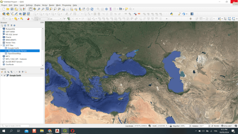
Understanding socio-economic inequality is key. To do this, we use tools like ArcGIS and QGIS. These systems turn data into clear, useful maps.
Popular GIS Software Options
ArcGIS and QGIS are top choices for mapping inequality. They help create detailed, interactive maps. These maps show patterns and trends in a region or population.
- ArcGIS – A leading GIS platform by Esri, it’s great for managing, analyzing, and visualizing data.
- QGIS – An open-source option, it’s free and has a big user base.
Tips for Effective Visualization
Creating maps for inequality needs careful planning. Follow these tips for clear, compelling visuals:
- Choose the right map types and techniques for your data.
- Use colors and legends that are easy to understand.
- Add interactive features like tooltips and filters.
- Include labels and annotations for context.
By using GIS software and following best practices, we can make impactful maps. These maps help us understand socio-economic inequality better.
Community Engagement Through Mapping
Participatory mapping and community-based GIS are key tools for tackling socio-economic gaps. They let people help in collecting, analyzing, and showing data. This makes them feel more involved and invested in the results.
Using Maps to Drive Local Policy
When people map their neighborhoods, they create powerful visuals. These maps show where resources and services are lacking. They help make policies that are fair and include everyone.
Citizen Mapping Projects
- The Healthy Neighborhood Equity Fund in Boston, Massachusetts, is a great example. Residents used mapping to find areas lacking in healthcare, healthy food, and green spaces. This helped the city decide where to invest.
- In Nairobi, Kenya, the Mukuru Mapping Project helped people map their informal settlements. This gave important data to local authorities, shaping urban planning.
- The Mapping for Change in London let residents work together on maps. They highlighted issues like air pollution and traffic. This led to policy changes from the city.
These projects show how participatory mapping can help marginalized communities. They drive real change in local policies.
“Participatory mapping empowers communities to become active agents in the process of addressing socio-economic inequalities, rather than passive recipients of top-down solutions.”
Policy Implications of Inequality Maps
Inequality maps are key in policy analysis, helping make decisions based on data to fight inequality. They show where inequality exists, helping policymakers understand the issues. This approach can lead to real change and a better society.
How Mapping Influences Decision-Making
Inequality maps push for policy changes, guiding lawmakers to focus on specific areas. They highlight inequality’s details, helping find and help underserved communities. This way, maps link data to decisions, tackling inequality’s roots.
Evidence-Based Policy Development
- Inequality maps give a solid data base for policy, making sure decisions are based on facts.
- They help spot key policy areas, guiding resource use to tackle big socio-economic issues.
- Maps also check policy effects, letting policymakers adjust based on data for better results.
Inequality maps turn complex data into useful information, changing policy and making a difference. By using these tools, policymakers can work towards a fairer society.
“Inequality maps have revolutionized the way we approach policy development, empowering us to make data-driven decisions that truly address the needs of our communities.”
Combining inequality mapping with policy analysis can change how we face socio-economic issues. It opens the door to a more inclusive and prosperous future.
Future Trends in Mapping Socio-Economic Inequality
The field of mapping socio-economic inequality is changing fast. New tech and more data are leading to better ways to see inequality. Artificial intelligence and machine learning will change how we use data, making our maps more accurate and useful.
Advancements in Technology
New tools with artificial intelligence and machine learning will find new insights in data. They can handle lots of data from different places. This means we can understand inequality better than before.
The Role of Big Data in Mapping
Big data is changing how we map inequality. It comes from many places, like government and non-profits. With it, we can see inequality in new ways. Predictive mapping helps us plan for the future.
| Technology | Impact on Inequality Mapping |
|---|---|
| Artificial Intelligence | Automated data processing, pattern recognition, and predictive modeling |
| Machine Learning | Improved data analysis, identification of hidden trends, and enhanced accuracy |
| Big Data | Comprehensive data integration, advanced analytics, and better-informed decision-making |
These technologies will make mapping inequality better. With artificial intelligence, machine learning, and big data, we can make society fairer and more inclusive.

Conclusion: The Importance of Continued Research
Mapping socio-economic inequality has shown us how vital ongoing research and teamwork are. By using geographic information systems (GIS), we can find out more about inequality’s causes. This helps us create specific plans to fix these issues.
Summary of Key Findings
This article talked about how GIS helps us understand socio-economic inequality. It showed us examples, data sources, and ways to display this information. We learned that using spatial data can give us deep insights into inequality’s spread. This helps communities and guides policy decisions based on facts.
Call to Action for Researchers and Policymakers
Looking ahead, researchers and policymakers need to team up more. They should use new tech like big data and better GIS tools. This will give us even more accurate and detailed information.
Policymakers can then use these maps to make better policies. These policies can tackle inequality’s causes and help reach the United Nations’ Sustainable Development Goals.
