Cartographic Mercator Projection vs Real Size of Countries
The Mercator Projection: A Useful but Flawed Map
The Mercator projection, created by Gerardus Mercator in 1569, became the standard map projection used for navigation due to its ability to represent straight-line courses as straight lines on the map. However, while useful for sailors, this projection comes with a significant downside—it distorts the size of landmasses, making regions near the poles appear much larger than they actually are.
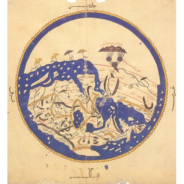
The Idrissi Map and Early Cartography
When we think about world maps, most of us picture the familiar layout we see in classrooms, atlases, or online. However, what if the world map you’ve always known is misleading? One of the earliest significant attempts at world mapping came from Al-Idrissi, a 12th-century Arab geographer who created the Tabula Rogeriana, a detailed and relatively accurate representation of the known world at the time. Unlike modern projections, the Idrissi map was drawn south-up and avoided the distortions we commonly see in today’s maps. This raises an important question: how accurate are modern world maps, and how do they distort our perception of country sizes?
For example:
- Greenland appears roughly the same size as Africa, but in reality, Africa is 14 times larger.
- Russia looks enormous, but it is significantly smaller than it appears in comparison to other landmasses.
- Antarctica is exaggerated, giving the illusion that it covers nearly half the globe.
Why Does the Mercator Projection Distort Sizes?
The Mercator projection is a cylindrical projection, which means that as it maps the globe onto a flat surface, it stretches landmasses further from the equator. This results in areas at high latitudes (such as Canada, Europe, and Russia) appearing disproportionately large, while equatorial regions (such as Africa, South America, and Southeast Asia) appear much smaller than they actually are.
you can visualize the true size of countries based on their cartographic projections using this plateforme.
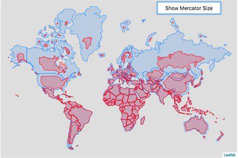
Mercator Projection with Satellite Imagery
Mercator Projection with Satellite Imagery

The Real Size of Countries: The Gall-Peters and Other Projections
To address the distortions of the Mercator projection, alternative projections such as the Gall-Peters projection have been developed. This map preserves area proportions, showing countries in their true relative sizes. Unlike Mercator, it correctly represents the vast size of Africa, South America, and Southeast Asia while reducing the exaggerated appearance of northern countries.
Other alternatives include:
- The Robinson Projection – A compromise between shape and size distortion, commonly used in educational settings.
- The Winkel Tripel Projection – Used by National Geographic, offering a more balanced view of the world.
- The Equal Earth Projection – Designed to visually maintain the proportions of continents more accurately.
Why Does This Matter?
The way we visualize the world affects our geopolitical perceptions. The Mercator projection, by making Western countries appear larger, has historically reinforced Eurocentrism and distorted how we perceive the importance and power of various regions. When people see Africa or South America as “smaller” than they really are, it can subtly influence economic, political, and social attitudes toward these areas.
List of Countries Area
50 Largest Countries by Area
50 Largest Countries by Area
| Rank | Country | Area (sq km) |
|---|---|---|
| 1 | Russia | 17,098,242 |
| 2 | Canada | 9,984,670 |
| 3 | United States | 9,826,675 |
| 4 | China | 9,596,961 |
| 5 | Brazil | 8,515,767 |
| 6 | Australia | 7,692,024 |
| 7 | India | 3,287,263 |
| 8 | Argentina | 2,780,400 |
| 9 | Kazakhstan | 2,724,900 |
| 10 | Algeria | 2,381,741 |
| 11 | DR Congo | 2,344,858 |
| 12 | Greenland (Denmark) | 2,166,086 |
| 13 | Saudi Arabia | 2,149,690 |
| 14 | Mexico | 1,964,375 |
| 15 | Indonesia | 1,904,569 |
| 16 | Sudan | 1,886,068 |
| 17 | Libya | 1,759,541 |
| 18 | Iran | 1,648,195 |
| 19 | Mongolia | 1,564,116 |
| 20 | Peru | 1,285,216 |
Conclusion: Rethinking Our Maps
Maps are powerful tools, but they are also representations, not perfect models of reality. Understanding the distortions in the Mercator projection helps us better appreciate the true scale of our world. Exploring alternative projections, such as the Gall-Peters map, allows us to challenge the misconceptions we may have unconsciously absorbed from traditional cartography. Next time you look at a world map, take a moment to consider: is this an accurate reflection of our planet, or just a useful but flawed tool?